Brand ID Evolution
Rekindling the art of traditional storytelling
Client Storytel
Brand strategy, Visual Identity, Creative Direction, Art Direction, Design Systems & Workflows
We led the global evolution of the brand for one of the world’s leading audiobook platforms, operating across 25+ markets with over 2 million subscribers. Alongside creative direction, we focused on improving efficiency across design and marketing teams, strengthening brand affinity, and establishing consistency across every touchpoint — from app UI to global campaigns and global organic social channels.
Logo
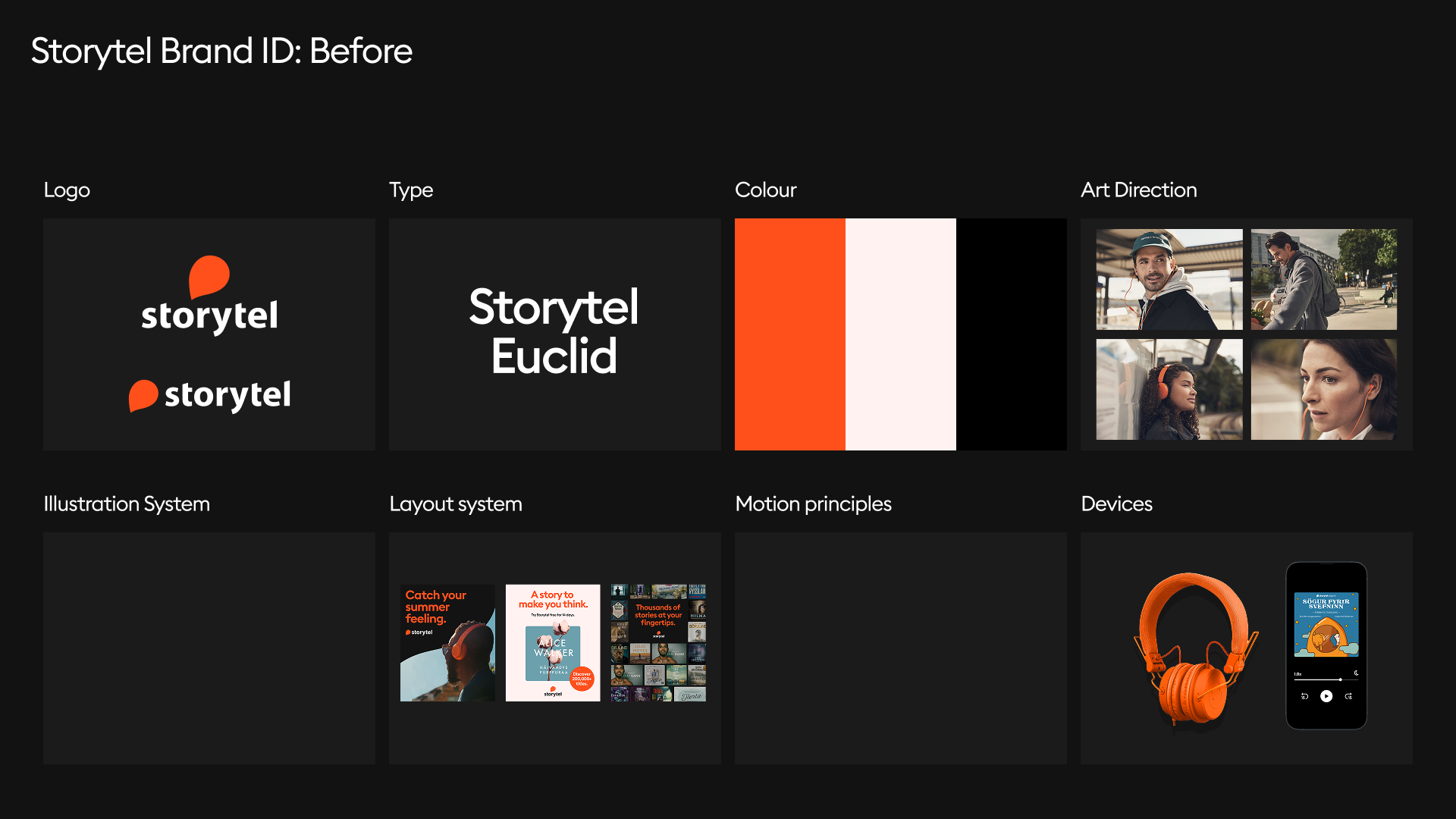
Existing (lacking strategy & guidance)
Type
Existing (acking guidance)
Colour
Distinctive brand color + Limited palette
Art Direction
Existing (update required)
Before
Illustration System
None (required)
Layout System
None (required)
Motion Principles
None (required)
Devices
Existing (update required)
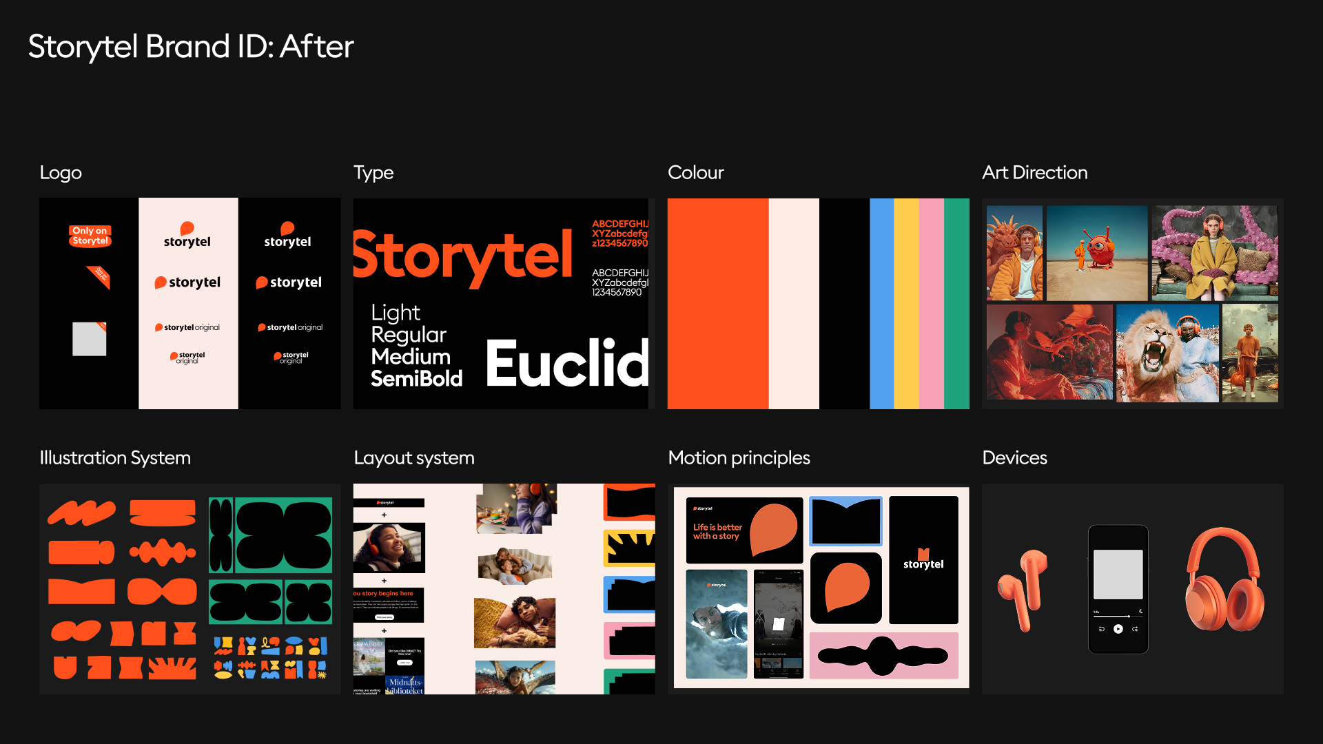
After
Logo
Updated guidelines & Brand Architecture
Type
Updated guidelines
Colour
Extended colour palette
Art Direction
Updated Art Direction and Creative Platform
Illustration System
New Illustration System
Layout System
New Layout templates for all channels
Motion Principles
New Motion Principles, Guidelines & Templates
Devices
Updated Devices
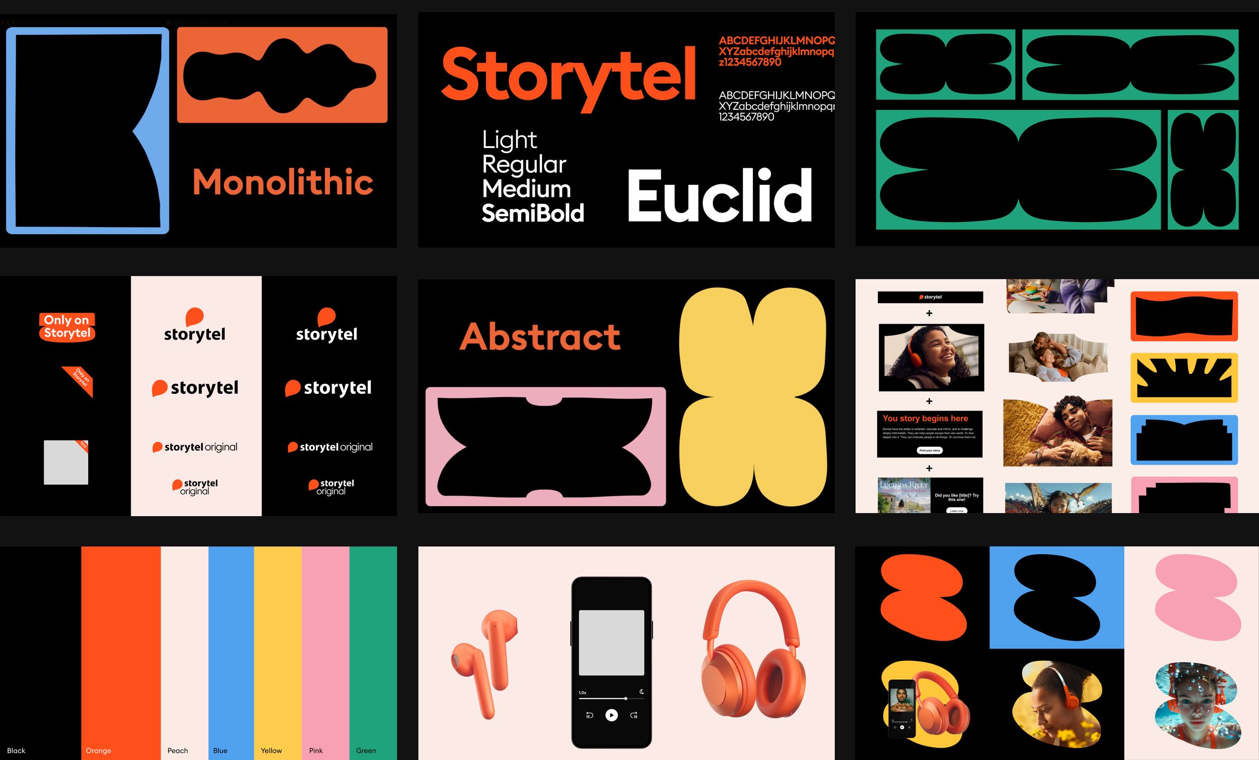
While Storytel already had strong assets—a logo, typeface, and core palette—our task was to expend the brand toolkit and visual identity into a more expressive and expansive system.
During our exploration, we uncovered that the original 2003 company logo was inspired by the shape of a flame, echoing the age-old tradition of storytelling around a campfire. While this meaning had never been expressed across brand touchpoints, we saw an opportunity to reignite that original spark. Internally, we reframed the orange “fire” mark as a symbol of human connection—a place where stories are shared and brought to life.


Engaging with Italian studio Illo, we into a design system that captured the glow and movement of firelight. A refreshed color palette was combined with the bold, abstract and flexible shapes to create a versatile illustration system that functions as either abstract or loosely descriptive.

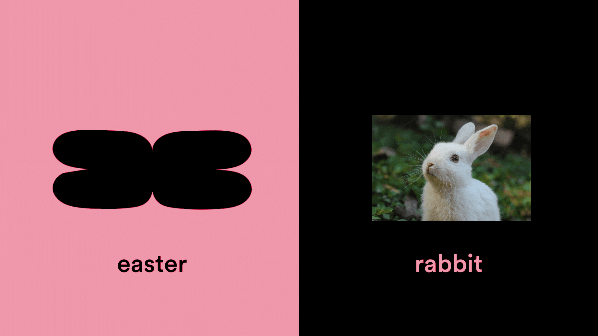
The evolved illustration style combined monolithic shapes with playful, human touches—designed to flex across genres while staying recognisable.
This visual system became the foundation for everything from app visuals to global campaigns, allowing the brand to express both scale and intimacy.
To support consistency and efficiency at scale, we established robust internal systems: thourough, brand guidelines, and internal brand libraries for design assets. Templates and toolkits were designed for global and local teams across all major channels—advertising, email marketing, social media, event collateral, and more. These systems empowered in-house and partner teams to execute creative efficiently and on brand.